


Our Approach
- Video
- Graphic Design
- Branding
- Logo Design
A new visual identity expresses the stability of the district and its forward-looking vision
Refreshed priorities and a renewed sense of purpose led the Nampa School District (NSD) to undertake a complete rebrand. The new identity needed to communicate the district’s commitment to student success, accessibility for all, the strength of the Nampa community, and continued innovation in education. To ensure the brand accurately reflected these values, Peppershock conducted extensive research through focus groups, surveys, and concept development. The result is a clean, inspiring logo that brings these ideas together in a simple, recognizable mark.
VIDEO
Getting the Word Out
Student and teacher recruitment videos help build awareness of the opportunities available throughout the Nampa School District. They highlight the district’s ever-increasing high school and college dual-enrollment programs, forward-looking use of technology, award-winning extracurricular activities, and a culture built on care, support, and high expectations. A personal interview with teacher Jon Buckridge offers an authentic perspective on what makes the district a rewarding place to teach.
Brand Development Story
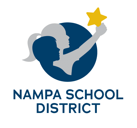
The district’s guiding principle, “Inspire Excellence — Every Child, Every Day,” became the foundation of the logo design. Because children are at the heart of the district’s mission, they naturally became the centerpiece of the mark. The figures represent students of different ages and genders, while the navy and blue color palette symbolizes the diverse backgrounds and experiences found throughout the community. The surrounding blue circle, representing both the Earth and a sense of unity, reinforces Nampa’s connection to the wider world.
The color palette of navy, gold, and gray was intentionally selected for its timeless quality, ensuring the brand remains strong and recognizable for years to come. The gold star symbolizes achievement, reflecting the district’s belief that it does more than provide opportunities—it empowers students to succeed. Positioned as though she has already reached it, the young girl holding the star reinforces this message of accomplishment, while the star itself also represents exploration, discovery, and the promise of new frontiers.

Branding
Logo
New Logo


Photography
Social Media
Email Marketing
Radio