Ripley Doorn Certified Public Accountants

Rebranding - New Logo Design

Our Approach
  • Graphic Design
  • Branding
  • Logo Design
  • Web

A new visual identity expressing the growth and reliability of this accounting firm.

Ripley Doorn Vertical Logo

A Brand is so Much More Than Just a Logo, It's an Experience

As companies grow and evolve, their identities may change. This is why Ripley Doorn Certified Public Accountants decided to update their branding with a new logo. Dating back to 1942, Ripley Doorn has been a consistent, reliable accounting source in the Treasure Valley, Idaho. While they still offer the same client satisfaction-based services, they were looking for a logo that preserves their brand values while infusing it with a fresh, contemporary feel. One of their goals was to not only serve and support their clientele, but to draw in new and talented individuals who are wanting to be apart of a well oiled machine. Below is the logo that was created over 20 years ago and served them well, but definitely shows its age. Ripley Doorn was thrilled with the new logo outcome, praising its clever design, vibrant colors, and strong brand identity.  CPA rebranding is important in keeping the brand current and fresh when trying to attract new CPA’s to the firm.

Original outdated Ripley Doorn Logo

VIDEO

Graphic Design

Brand Development Story

The goal of Ripley Doorn is to instill trust and confidence in their brand and the accountants who work for them. We included bright colors and a dimensional aspect to the logo to keep in line with the current design trends and give it a fresh look that stands out. The thinner sans serif typeface also speaks to a clean, modern feel that is easy to read and shows stability in the all caps font. There are multiple versions of this logo that can be used in a variety of spaces. Whether the logo mark is used as social media icon, the full logo is used for the sign on the front of their building, or the stacked logo is printed on their promotional items, there is an option for every use!

The duo-tone green colors signify growth, freshness, and good luck. Green also represents both money and prosperity, embodying the success and thriving opportunities that can be achieved when working with Ripley Doorn. The gray text that is paired with the vibrant green logo mark supports the bright colors by remaining calm, stable, and reliable. Grayscale logo options also give it the versatility to be applied on strictly monotone surfaces as well.

Branding

Brand Guidelines

In addition to designing various logo options, we created a brand guidelines sheet detailing proper and improper logo usage, the chosen color palette, and the selected typefaces.

Logo

New Logo Variations


Web

With a new logo, comes a new website

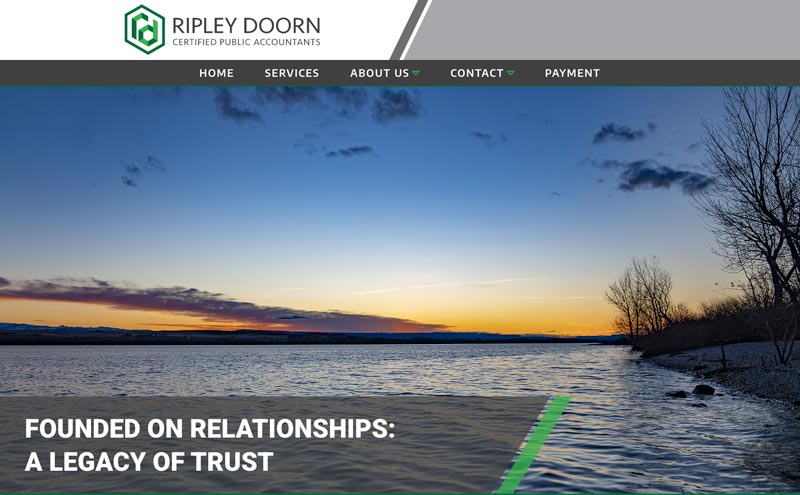
With the new logo complete, the process of having new shirts embroidered, new business cards printed and new signs for the buildings constructed began.  This also meant it was time for a new website.  The Ripley Doorn brand is now being represented as a cohesive, well thought out, modernized look for a business deeply rooted in our community.

CPA rebranding - new website design and build for Ripley Doorn, CPA

Photography

Social Media

Email Marketing

Radio

and in the end

Results

Feedback is a gift and this is one gift we’re not returning!  Hear what some of the partners had to say about the rebrand, the new website and how potential recruits are responding to the new logo:

“Great comments on the logo!  We had gone so long with the former logo that we didn’t even notice it.  We are proud of this and appreciate your team’s approach to the design process.”  – R

“We are loving the new logo and have received a lot of great feedback on the fresh new look!   It looks fantastic in the lobby.  We have recognized a difference in how students respond to our table at recruiting events and I’m certain that the new logo and upgraded look of the swag has played a significant part in this!” – Jorie

“We enjoy it as well. Many comments from clients who enjoy the new look as well as comments from business neighbors who like the new sign and logo outside. Feels much more updated.  Thank you for all the assistance you and your team have provided. The website is a significant upgrade!” – Tyson

0
Your Cart
Your cart is empty.